Air quality comparison · Australia, 2131 km apart
Adelaide vs Perth Air quality index (AQI) today
Perth has cleaner air than Adelaide right now: AQI 25 (Good) against 26 (Good).
Both sit in the same EPA band, so the health advice is the same for each today. Over the past 7 days, on modeled daily averages, Perth averaged AQI 40 against 41, and it was the cleaner of the two on 3 of those days. Adelaide has lost more forest since 2001. Adelaide has more tree cover.
Updated . Lower is better on the US EPA index: 0–50 is Good, above 300 is Hazardous. Measured by Airleaf.
Adelaide26Perth25
Head to head
Adelaide vs Perth at a glance
Perth is ahead on 4 of 6 measures, and Adelaide on 2. The better figure in each row is marked.
| Adelaide | Perth | |
|---|---|---|
| Air quality nowUS AQI. Lower is better. | 26 | 25 (better) |
| PM2.5Fine particles, µg/m³. | 4.6 | 4.5 (better) |
| Past week's averageUS AQI, 7 days. | 41 | 40 (better) |
| Forest lost since 2001Within 10 km of the center. | 216 ha | 78 ha (better) |
| Tree coverWithin 2 km of the center. | 32.4% (better) | 18.1% |
| Trees still neededTo reach a healthy canopy. | 0 (better) | 30.3K |
Air quality today
What is the air like in Adelaide and Perth right now?
Perth has cleaner air than Adelaide right now: AQI 25 (Good) against 26 (Good). PM2.5 is setting the index in both.
Both readings come from nearby ground stations.
AdelaidePerth
Concentrations at the same moment as the index above, for the pollutants both places report. Lower is better. The dark marks on the PM2.5 and PM10 rows show the WHO's 24-hour guidelines (15 and 45 µg/m³).
Adelaide: Ground station · Adelaide CBD, 200 m away. Data: World Air Quality Index Project, EPA South Australia :: Air quality in South Australia.
Perth: Ground station · NASA GSFC Rutgers Calib. N5, 5.1 km away. Data: OpenAQ · Clarity.
The past week
Which had cleaner air over the past 7 days?
Over the past 7 days, on modeled daily averages, Perth averaged AQI 40 against 41, and it was the cleaner of the two on 3 of those days. A single reading can catch a city on a bad afternoon; the week says whether it was the weather or the place.
- Cleaner days
- Adelaide3Perth3
- Average AQI
- Adelaide41Perth40
- Worst day, AQI
- Adelaide54Perth46
The daily numbers (7 days)
| Day | Adelaide | Perth |
|---|---|---|
| Nov 5 | 54 | 46 |
| Nov 6 | 54 | 41 |
| Nov 7 | 39 | 41 |
| Nov 8 | 31 | 43 |
| Nov 9 | 19 | 27 |
| Nov 10 | 43 | 43 |
| Nov 11 | 50 | 37 |
Daily averages from the CAMS atmospheric model for both places, so the week compares like with like. They can differ from today's reading at the top of the page wherever that comes from a ground station.
What it means today
Is it safe to go outside in Adelaide and Perth today?
Air quality is satisfactory for everyone. Both are in the same EPA band today (Good), so the advice is the same.
Exercise outdoors
A good day to be active outside.
Windows
Open them to air the house.
Masks
Not needed.
Air purifier
Not needed.
Against everywhere else
How do Adelaide and Perth compare with the rest of the world?
Right now Adelaide's air is cleaner than 83% of the 5,420 places Airleaf tracks, and Perth's is cleaner than 84%. Within Australia, that is 30% and 40% of its 21 measured places.
Cleaner air than…
- Adelaide
- Beats 83%
- Perth
- Beats 84%
More tree cover than…
- Adelaide
- Beats 73%
- Perth
- Beats 42%
Includes model estimates as well as station readings, so it can differ from our most polluted and cleanest air rankings, which use station readings only.
Deforestation · 2001–2025
Which has lost more forest, Adelaide or Perth?
Adelaide has lost more: about 216 ha of forest within 10 km of its center from 2001 to 2025, against 78 ha around Perth. 182 ha of that was cleared for good, for farms, mines or towns.
Measured within 10 km of each center, from the yearly satellite maps of forest loss: a wider circle than the one for tree cover, because forest is usually lost at a city's edges.
Worst year: 2004, with 40 ha lost.
Worst year: 2007, with 10 ha lost.
| Adelaide | Perth | |
|---|---|---|
| Forest lost since 2001Cleared, burned or logged. | 216 ha | 78 ha (better) |
| Share of its forestOf what it had in 2000. | 5.6% (better) | 9.3% |
| Cleared for goodTurned into farms, mines or towns. | 182 ha | 70 ha (better) |
| Recent trend2021–2025 against the five years before. | Too little to call | Too little to call |
| Main known cause | Towns and roads (71%) | Towns and roads (90%) |
Satellite timelapses
Watch both change, year by year
A clear satellite photo a year of the land around each city. Press play, turn on the forest cleared since the first year, or drag the before and after.
Adelaide
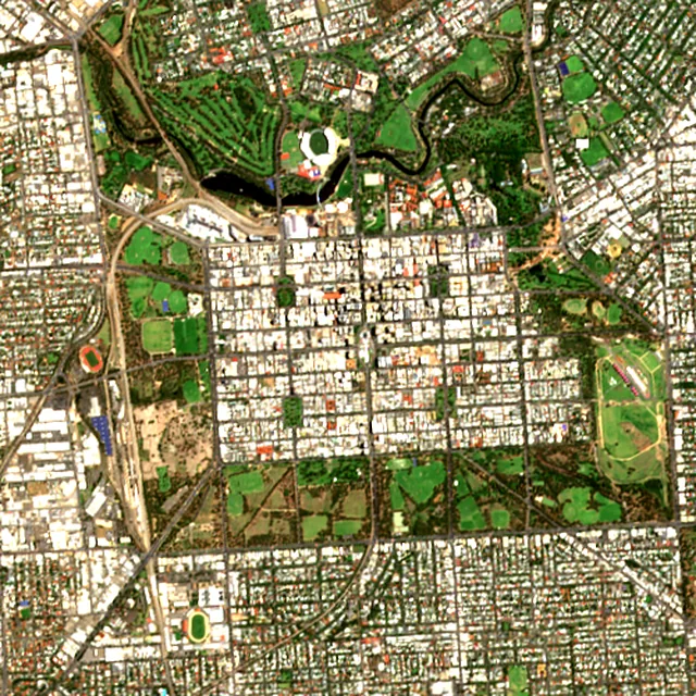
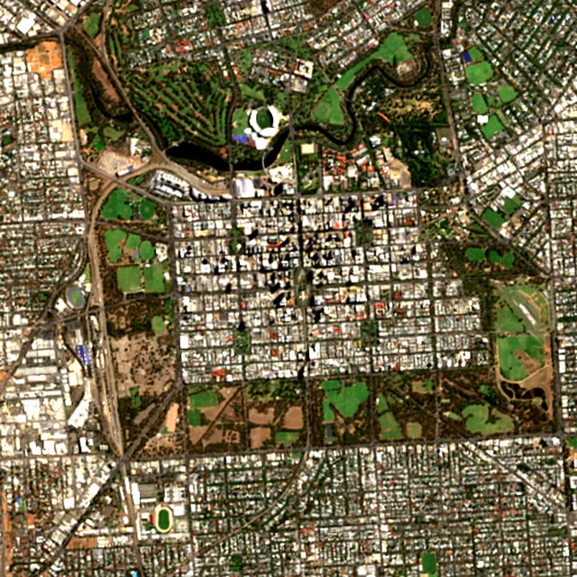

2017: satellite photo from January 2017 of a 5 × 5 km area in the city center.
Perth
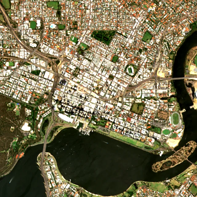
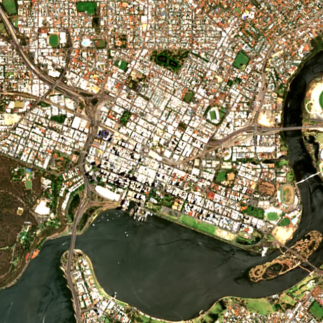

2017: satellite photo from March 2017 of a 5 × 5 km area in the city center.
Trees
Which has more trees, Adelaide or Perth?
Adelaide has more tree cover: 32.4% of the land within 2 km of its center against 18.1% around Perth, or about 101,279 trees against 46,116.
The dark mark is each place's canopy target: 30% of the land, raised where air quality is poor.
| Adelaide | Perth | |
|---|---|---|
| Trees standingEstimated from the canopy area. | 101K (better) | 46.1K |
| Trees still neededTo reach the target. Fewer is better. | 0 (better) | 30.3K |
| CO₂ absorbed each yearBy the trees already standing. | 2.2M kg (better) | 1.0M kg |
Tree cover on the satellite image
The same 2 km radius around each center, with the tree cover the satellite found marked on it.
Reading these numbers
How this comparison is made
Air quality index
The US EPA index, computed from current pollutant concentrations: ground stations where a place has them nearby, and the CAMS atmospheric model everywhere else. It moves hour to hour, so it is a snapshot rather than a verdict on either place. The guideline marks are from the WHO's 2021 air quality guidelines.
Trees and forest
Tree cover is the share of ground under canopy within 2 km of each center, read from Sentinel-2 satellite imagery at 10 m detail. It measures that circle, not the whole municipality, which is what makes the two comparable. Forest loss comes from the University of Maryland's Global Forest Change maps.
More on the method on the About Airleaf page.
Frequently asked
Adelaide vs Perth: your questions answered
Is Perth cleaner than Adelaide?
On air quality, yes, right now: Perth reads AQI 25 against 26, a gap of 1 points on the US EPA index. This is a live reading rather than an annual average, so it can reverse within a day. Over the past 7 days, on modeled daily averages, Perth averaged AQI 40 against 41, and it was the cleaner of the two on 3 of those days.
Is it safe to exercise outdoors in Adelaide and Perth today?
The advice is the same for both today. Air quality is satisfactory for everyone. Adelaide reads AQI 26 and Perth reads AQI 25.
Which has lost more forest, Adelaide or Perth?
Adelaide has lost more: about 216 ha of forest within 10 km of its center from 2001 to 2025, against 78 ha around Perth. 182 ha of that was cleared for good, for farms, mines or towns.
Which has more trees, Adelaide or Perth?
Adelaide has more tree cover: 32.4% of the land within 2 km of its center against 18.1% around Perth, or about 101,279 trees against 46,116. Both figures describe the same-sized circle of ground around each center, not the whole municipality.
How many more trees do Adelaide and Perth need?
Adelaide needs about 0 more to reach its canopy target of 30%, and Perth about 30,319 to reach 30%. The target starts at 30% of the land and rises where air quality is poor.
Are Adelaide and Perth measured the same way?
The method is the same: the US EPA index for air, and Sentinel-2 satellite imagery at 10 m detail over an identical radius for trees. Both readings come from nearby ground stations. Nothing is adjusted for population, city limits or climate.
How often does the Adelaide vs Perth comparison update?
The air readings refresh about once an hour, and each reading's local time is shown at the top of the page. Tree cover comes from the latest clear satellite image of each area (Mar 14, 2026 and Mar 6, 2026), and the forest figures are published yearly.
Keep going
Compare them with somewhere else
Build your own
Compare Adelaide with somewhere else
This place
Adelaide